Don’t touch, no photography, keep off the grass. Museums are sometimes so good at telling visitors off, they seem to forget to do anything else. At TextWorkshop we’re often asked by clients for help with knotty issues such as how to write a great ‘no entry’ sign.
As a result, we collect examples that show how you can keep a friendly tone and still let visitors know what the boundaries are.

Of course, we also have a haul of signs that seem intent on putting everyone off visiting ever again.
So what are the tips for great signage that works – and still keeps your welcome intact?
It’s all about how you use your tone of voice – whether you’re a bossy dictator or a friendly expert.

Dea was recently in Abu Dhabi and saw an exhibition with plenty of things to touch and feel. The signage was welcoming and inviting, and as she posted on Twitter, you could even play with the curtains.
But how about when you do need to tell people that touching, standing or sitting isn’t suitable?
We admire the Story Museum, where they’ve stayed in character to write instructional signage along with other text. Whether it’s a fire exit, a toilet sign or a warning of an uneven surface (right), their tone is really imaginative.
Or at Chatsworth, it’s back to curtains, where you get to see the impact of everyday use on a decorative tassel. We can all see the reason why touching isn’t a good idea. We’ve entered the expert world of those who care for the fabric of the house – but without any finger-wagging warnings.

The Natural History Museum made a virtue of the temporary closure of the Dinosaurs gallery. Their sign, which started with the phrase if it has to be a dinosaur today, directed visitors to other parts of their collections and sounded suitably sympathetic to dismayed dinophiles.
The National Trust use the classic teasel on seat to indicate that sitting isn’t permitted, and that works well. We also like the NT sign (right) that essentially invites us to use their umbrellas but not to leave them lying around afterwards. The Horniman let us know how hard they’ve worked to dig over their flowerbeds and implore us not to undo their efforts. All good ways to bring visitors in on the secret of why you’d like them to do what you’re asking.
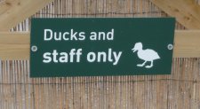
But the Wildfowl and Wetland Trust get a prize for their short and sweet no entry sign. As a campaigning organisation (with whom we worked in-house) their first priority is the birds – they even go before staff.
Do post your examples of good and terrible signage on our Twitter feed @textworkshop and we can all enjoy.